Showing posts with label Tutorial. Show all posts


Typography is a remarkable piece of art that has its own styles and techniques to making a written language more appealing when it comes to learning and recognition. Today, you will witness inspiring examples of 3D Typography created by various talented artists. You will see in this article the process and tools they’ve used  in creating a 3D inspiration.

Mateus Orrico

“Picture 1 – Impact
I’ve always been very curious about 3D modeling, but never had time to study the specific software, so I decided to try with what I ruled: Photoshop and Illustrator. I also wanted to improve the quality more lights and shadows in mine and was this mixture that came these two parts. First I used Illustrator to generate letter by letter in 3D using the Extude tool. Worked with the color of the white letter and not much shifted in light, just enough to create a good contrast between the faces. After play was letter by letter in Photoshop and there give color to each of them and increase the contrast. After positioning and color each letter, I wondered where the light should come and started working in the shadows. I selected face by face and creating a mask it. In these masks, I was painting with a brush black soft areas that I thought should have shade and adjusting the opacity of these layers. I used 1-3 coats of black to try to get the most of a real shadow. After finalizing the shadows, did the same process with the areas that should be more enlightened, only this time by painting it white. Same process: masks and adjustment of opacity. At the end, I added some elements to give a little more life to the piece. IMPACT name was just a tribute to source I used (which has the same name) because it was one of the easiest sources that had found to work this technique.

Picture 2 – Foxine
This image was a gift I made for a college classmate (who is nicknamed Fox or Foxine) and the process was very similar to the previous one. As I mastered relatively well these effects, thought about going a step further and thought “Why not add real elements to 3D?”. With that in mind, I chose the pictures of some foxes in positions that I thought were close the 3D. The secret was here working with lines that end faces and shadows. Use the shadows to merge 3D with real was the key for the part to stay nice and look as real as possible. Then only I used some bokeh effects to give a shine to the art.”
Adam Nakiela

“I took a participate in the session of speedmodelling about creating 3D typo (on the forum of Newtek- producer of 3D software which I use – Lightwave 3D), made some project, and later- got this new idea to use millions of pins to form a 3D text. For this, I use instances feature from Lightwave 3D, where single block was multiplied to about 5 millions on the scene- creating a matrix of pins, their height was driven by some layers of textures, and similiar with color. For  foreground- with similiar technique- i created crystal cubes. After rendering- I did some post-processing in Adobe Photoshop – color correction, depth of field using lens blur, etc.”
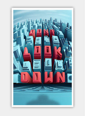
Coen Pohl

“Don’t look down:
For this project I wanted to practice more with unusual perspective points and 3D type. The result is skyline vista where you start looking at the horizon in the distance but slowly look down onto the street when moving your eyes down the illustration. The first step was to create a so called curvilinear perspective grid. This kind of perspective allows for multiple horizons and vanishing points. The effect is a bit like creating a vertical panorama with a camera when standing on a building. After that I made a rough layout of where the buildings and letters would come by drawing just the rooftops on the grid, followed by the walls, using the pen tool in illustrator. For the windows I first created an array of window shapes in Photoshop. Then I used the skew and distort functions in Photoshop to move the rows of windows into the right positions on the walls of the buildings.

Isometric Amsterdam:
The idea behind this project was to create a building pattern based on the typical Amsterdam canal houses. I’m fascinated by isometric designs and illustrations as it is a good way to create abstract endless cityscapes in all directions without having to worry about the issues with normal perspective drawings. Amsterdam canal houses often have roughly the same dimensions, so they are ideal to create a pattern with. The whole project was done in Adobe Illustrator CS5. All buildings have the same base shape, which was created by hand, using a simple isometric grid (there are plenty of them available for download on
the internet). The smaller details and letters however, are created with the 3D tool found in Illustrator under the ‘Effects’ menu item. First I created the letters in 2D using a normal grid so that all letters would have the same look & feel. Then I used the 3D tool to instantly create isometric versions of these letters. I ungrouped the 3D objects into 2D shapes in order to have more control on the colours of each of the sides. I used the same technique to create some of the smaller details on the buildings like the stairs, roof decorations and windows.”

Marcus Byrne

“Smash This (Self initiated project to explore the ‘Explode’ tools in Cinema 4D.)

Created the text, extruded, then rotated each character slightly. Added the Explosion FX and played around with the object properties.
Textured with a reflective material and used a Sky Object to reflect in the text.
After various test renders, output with Channels and open in Photoshop.
Added final composition image layers with various overlays. The ‘Smoke image’ is set to screen mode to knock out the black.

Metal (Self initiated project to explore metallic reflections in Cinema 4D.)

Created a scene with Text, Floor base and Spheres. Worked out a basic composition that felt right. Textured with a reflective material and used various lights until I was happy. Textured the floor base with a Wood texture. Open in Photoshop for final composition grade.

Mega Pick (Commissioned 3D Type for Ladbrokes.)

The Type needed to feel huge, solid gold and heavy. The type lock up was created in Illustrator. In Cinema 4D, I created a scene, imported Type, extruded it, added a Floor base to catch shadows. Used a very wide Camera angle to give the illusion of looking up at this huge type. Worked out a basic composition that the client particularly wanted. Textured with a gold reflective material and used various lights to reflect in the material. Open in Photoshop for final composition grade.”


3D Typography of Examples

By: Unknown on: 6:10 AM
Today’s feature is about freelance 3D artist, art director, and trainer who has been professionally working for almost ten years now. He is doing a variety of things related to computer graphics, design, and illustration. Read on and be inspired on his works

Can you tell us something about yourself? Do you have some kind of early artistic memory that has stuck with you over the years that you could share to us?

First off, thanks for having me here, it is such an honor. I am a freelance 3D Artist specializing in Lighting and Storytelling – the latter I enjoy the most. One of the early memories I have with art was tracing over the comic books that our mom would buy us whenever she gets home from the market. My elder brother and I would then take a carbon paper and a bond paper, place it at the back of the page, and trace over the outlines. It has been a wonderful experience and one that I couldn’t forget – since that’s where I got my interest with art and drawing in general.
Since you are a self-taught 3D artist, when and why did you start learning it?


I have always been fascinated with shapes, forms, and depth for as long as I can remember; and what more gratifying feeling than to recreate the world around me, or better yet, to create an entirely new world. As much as I love drawing in 2D, the added dimension of depth

3D Artist, Art Director and Trainer Reynante Martinez

By: Unknown on: 5:57 AM
HOW TO CREATE SOCIAL MEDIA ICONS USING THE FREE FONT AWESOME FONT IN PHOTOSHOP

In this tutorial you will learn how to create some cool looking social media icons in Photoshop by simply using the free font Font Awesome.
What you’ll be creating
We will be creating some flat social media icons: we’ll start with the background then proceed with the icons. We’ll finish it up by creating some effects to make the icons more original like the gloss effect or the long shadow. You’ll need Photoshop CS3 or newer to follow this tutorial.
Tutorial Resources
  1. Font Awesome font
  2. Font Awesome Cheat sheet
Step 1
Create a New File at 500×400 pixels
Create a New Group and name it ‘Background’
Step 2
Fill your background with the color #e7e9ea using the Fill Bucket Tool.


Step 3
To add more effect to the background we will be adding some gradient. Click on the Adjustment Layer icon and choose Gradient… and use the following settings:
Blend Mode: Soft Light | Opacity: 25%

Step 4
Create another group and this time name it ‘symbols’
Step 5
Before anything else, to make this work easier and more organized-looking, we need Rulers and Grids. These can be accessed by simply going to View > Rulers and View > Show > Grids. Here are my setting for both the Rulers and Grids (this can be accessed by going to Edit>Preference):
Now that we have that, we need to add giudes and this can be done by simply clicking and dragging from the ruler. Click and Drag from the vertical ruler if you want a vertical giude and vice versa. Here is how I divided the canvas (each icon being 50×50 pixels big and a 25 pixels space between each one):
Step 6
With the font we are working with in this tutorial, Font Awesome, you can add costumizable icons for your website. Normally, this is done by placing the CSS of the font to your website but since we are working with Photoshop, we need to copy each icon you desire to use from their Cheatsheet. So open up the said page, scroll down and look for all the icons you would like to use. I used the icons for the following (social media) sites: Twitter; Facebook; Tumblr; Google +; Instagram; Youtube; Twitch; Dropbox; Deviantart; Pinterest; Skype; Feed.

Step 7
Once you have found the icon you would like to use, copy it (Highlight it then Right Click> Copy..)


Then go back to Photoshop and grab your Text Tool from the Tools Panel. Change the Font settings as shown:
Step 8
Repeat the previous step until you have pasted all the icons you would like to use.

Step 9
Create a new group and rename it to ‘icon bg’ and place it below the ‘symbols’ Group
Step 10
Create a new layer and place it into the group we just created. I renamed the layer to ‘icon bg’.
Step 11
Using the Rectangular Circle Shape Tool (located at the Tools Panel below the Text Tool) I created the background of the icons following the guides we did earlier. Create the background on that layer only to make your work easier to look at.
Here are all the colors I used:
Twitter:#6bd1f4;
Facebook:#5a93cb;
Tumblr:#3c6a9c;
Google +:#e44940;
Instagram:#9bd29d;
Youtube:#f4504c;
Twitch:#a96db6;
Dropbox:#81d5ed;
Deviantart:#6e8e61;
Pinterest:#f25f5f;
Skype:#67d5f4;
Feed:#e9951d;
Now you don’t specifically have to use the same colors as I did, you are obviously free to change the colors and use whichever color you prefer to make your work more original.

If you don’t like the look of the rectangular circles, you can always use other shapes like a square or circle. To make a perfect circle or square, be sure to hold the SHIFT key as you are making them.
Step 12
If you are already pleased with what we have just done, you can stop here but if you would like to spice up the icons some more go on and continue reading. We shall start by adding some Drop Shadow to the icons. Open the ‘symbols’ group, select one of the icons and click the fx icon > Drop Shadow. Use the following settings:
Step 13

Repeat the previous step with the rest of the icons. To make your work a lot easier, right click on the layer > Copy Layer Style. Then select the rest of the icons/symbols layers, right click > Paste Layer Style.

Step 14
Now add some Inner Shadow to the background of each icon. So open up the ‘icons bg’ group, select the layer and click the fx icon > Inner Shadow. Use the following settings:
Step 15
Create a new layer and name it Gloss Effect. Change the foreground color to #ffffff; using the Rectangular Marquee Tool, create some rectangles that is just half the size of your icon (approx. 50x25pixels). Do this for all of the icons.
Then Change the Blend Mode to Soft Light and Opacity to 20% and Fill to 80%.
Step 16
(If you are doing this step, be sure to not show the Gloss Effect) Create a new layer and name it to Long Shadow. This step is a bit harder compared to rest of the effects. Place the new layer below the Gloss Effect layer.
Step 17
Grab the Polygonal Lasso Tool and start creating some tilted rectangles: start by following the shape of your icon only from the bottom-right side then make a diagonal line until it reaches the bottom-right end of the icon’s background,make a straight line just until it reaches the center of the background then connect the lines.
Step 18
Last step! Change the layer’s opacity to 10% and it’s fill to 0%.
Now Click on the fx icon and select Color Overlay…. Use the following settings:
Now Select Gradient Overlay.. and use these settings:

Final Results

Download the PSD


HOW TO CREATE SOCIAL MEDIA ICONS USING THE FREE FONT AWESOME FONT IN PHOTOSHOP

By: Unknown on: 10:22 AM

 
Copyright © adobe plus | Mr Bashar By Themes
Blogger Templates Wallpapers Hack Wfi