GUIDE ON DESIGN SPACE IN ADOBE PHOTOSHOP CC 2016
http://adobe-plus.blogspot.com/
Design Space is a new feature available in Adobe Photoshop CC 2015 as a Technology Preview and although we could call it a workspace, we wouldn’t be entirely correct. A replacement interface I believe would be a more appropriate term since what it does is replace your usual Photoshop interface with a more minimalist one that has only the tools and adjustments a UI designer would need. This provides designers a more suitable and efficient workspace by reducing clicks and mouse movements.
Enable Design Space
IMPORTANT: Mac OS X 10.10 or Windows 8.1 64bit or higher are required and it only displays in English.

As I previously stated, Design Space is currently a Technology Preview and it needs to be manually enabled. To enable it you have to go to Edit > Preferences > Technology Previews and check the box. After switching you should see a little introduction to Design Space.
Tab menus
Now let’s introduce it’s features and the differences it has with your usual Photoshop interface. Let’s start with the tabs, as you can see some of them are missing and we have a new one, Arrange which we can use to align objects, flip and group them in the layers panel among other things.
Creating a new document
There’s two ways of creating a new document in Design Space, the easiest way is through the Template panel that you can see as you enter Design Space, which offers templates for the most popular devices. And of course there’s the old way through the File tab, there you can select New ( Ctrl + N ) and create a document with the same size as your last template used, New…( Alt + Ctrl + N ) will open the usual Photoshop window where you create a new document with your own settings and New From Template which does the same job as the Template panel.

Tools
Design Space (Preview) offers a limited set of tools, their main use remains the same with a slight change to one tool in particular. Move Tool (V), the tool we use to move objects around the canvas is replaced with Select Tool (V), which can also be used to change a shape’s form by double clicking on it and navigate through layers. The other tools are Rectangle Tool (R). Ellipse Tool (E) and Pen Tool (P) for creating shapes and Type Tool (T) to insert text.

Adjusting objects: Align
You can align objects through the Arrange tab or the align panel on the right. Two or more objects are required to be selected. To select multiple objects hold Shift and click on them.
Adjusting objects: Positioning and size
For a more precise sizing and positioning we’ll use the panel below the first one. In Design Space we set the values in pixels. W stands for Width and H for Height, we can lock them together to keep the ratio when we change one field. The fields below shows the position of the object on the canvas. Then there’s the option to rotate the objects, alternatively you can rotate objects on the canvas by having them selected and hovering the corners and lastly we have the options to change position between objects.
Styling objects: Vector
Okay, now let’s move on to styling. The first thing we can modify is the Opacity and the layer mode and after that there’s the Vector section, which you might find familiar if you worked with Adobe Illustrator. What it does is, it allows us to modify a shape or combine it with other shapes. The options we have are Unite, Subtract,Intersect and Difference, below you can see the result of using each option with two shapes. Both shapes have to be selected for this to work.
Styling objects: Fill
Fill can be assigned by either picking a color from the color picker that appears when you click the square or by setting it through the input field, which accepts Hexadecimal colors (#000000), RBG ( rgb(255, 0, 0)) and even common names such as “red”. Check these pages for more information: 1,2. The Alpha field is similar to Opacity but it will only affect the fill.
Styling objects: Stroke
Stroke has what Fill has and two more fields, we can specify the size of the stroke and it’s alignment, we can set it on the inside, on the outside or on the center.
Styling objects: Shadows
Lastly, we can add shadows on the outside and on the inside of an object. We can set the color, which makes it more of a outer glow, it’s positioning (X,Y), Blur and Spread. These two sections are activated by clicking on the + sign.
Styling objects: Text styling
When it comes to text the styling is pretty simple, we have the Typeface field to select the font and the rest of the fields that comes with it, like weight, size or letter.


Design Space Development
You can find out more about it and follow the development  click hear


DESIGN SPACE IN ADOBE PHOTOSHOP CC 2016

By: Unknown on: 8:45 AM
adobe-plus.blogspot.com
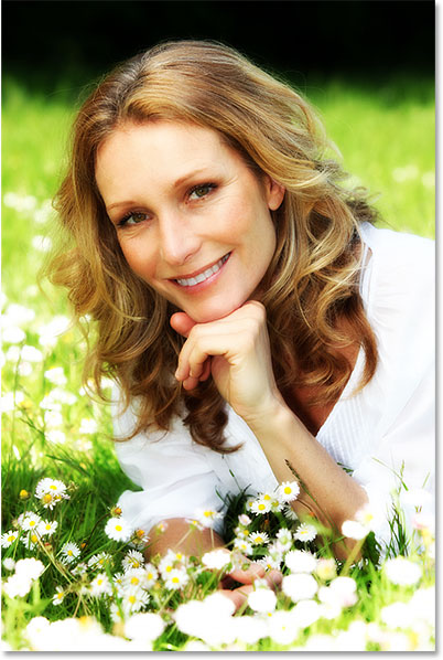
Here's how it will look with the glow applied. Not only does the effect help to soften the photo, including the woman's skin, but it also enhances the overall contrast and makes the colors appear more vibrant:
Step 1: Duplicate The Background Layer
With my image newly opened in Photoshop, if we look in my Layers panel, we see the photo sitting on the Background layer, currently the only layer in my document:
The Layers panel showing the photo on the Background layer.
The first thing we need to do for our soft glow effect is make a copy of the Background layer, and the easiest way to do that is to click on the Background layer and drag it down onto the New Layer icon at the bottom of the Layers panel (it's the second icon from the right):
Dragging the Background layer onto the New Layer icon.
Release your mouse button when your hand cursor is directly over the New Layer icon. Photoshop will make a copy of the Background layer, name the new layer "Background copy" and place it above the original:
Step 2: Rename The New Layer
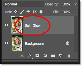
It's always a good idea to rename layers in your Layers panel so you have a better sense of what's on each layer and what it's being used for. Let's give the "Background copy"


 layer a more descriptive name. To rename a layer, simply double-click directly on its name in the Layers panel. This will highlight the current name:
Double-clicking on the name "Background copy" to highlight it.
Since we'll be using this layer to create our soft glow effect, let's name it "Soft Glow". Press Enter (Win) / Return(Mac) on your keyboard when you're done to accept the name change:
The "Background copy" layer is now the "Soft Glow" layer.
Step 3: Apply The Gaussian Blur Filter
To create the actual soft glow effect, we'll first apply some blurring to the "Soft Glow" layer. Then we'll change the way the blurred layer mixes with the original image below it by changing its blend mode.
To blur the layer, we'll use Photoshop's Gaussian Blur filter. Go up to the Filter menu in the Menu Bar along the top of the screen, choose Blur, and then choose Gaussian Blur:
Going to Filter > Blur > Gaussian Blur.
This opens the Gaussian Blur dialog box, which lets us control the amount of blur being applied to the layer using the Radius slider along the bottom. The further you drag the slider to the right, the stronger the blur effect will appear. Photoshop gives us a live preview of the effect in the document, so keep an eye on your image as you drag the slider to judge the results.
We don't want to blur the image so much that our subject becomes unrecognizable. We're just trying to soften things up a bit, so lower radius values tend to work best. Keep in mind, though, that the blur amount that works best for your specific image may be different from mine and will depend a lot on its size, with larger photos needing more blurring than smaller ones. Generally, for a subtle glow effect, a radius value of somewhere around 10 pixels should work well:
For a subtle glow, use smaller radius values.
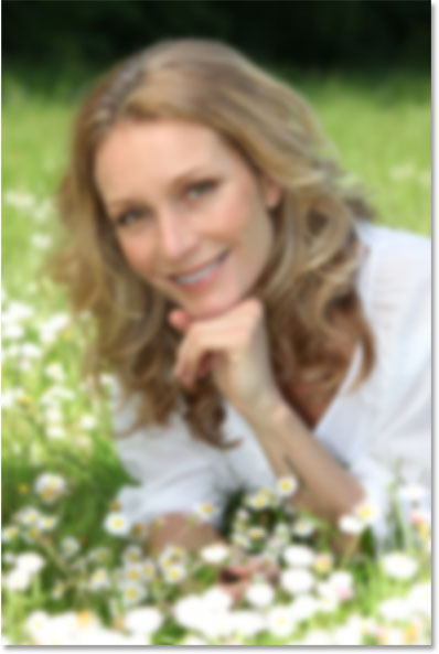
Here's what my blur effect looks like with a radius value of 10 pixels. Notice that while the photo looks softer than it did before, we can still make out plenty of detail. We'll see even more detail once we change the layer's blend mode in the next step:
The blurring effect with a radius of 10 pixels.
For an even softer, more dream-like glow effect, try a larger radius value of around 20 pixels:
For a more dream-like glow, use a larger radius value.
Here's my blurring effect using a 20 pixel radius. We can still make out detail in the photo, but the blurring is definitely stronger this time. Choosing the right amount of blur is really a personal choice and will depend on the image. In my case, I think this is too much so I'll go with the smaller 10 pixel radius. When you're happy with the results, click OK to close out of the Gaussian Blur dialog box:
The blurring effect with a radius of 20 pixels.

Step 4: Change The Blend Mode To Soft Light

Now that we've blurred the "Soft Glow" layer, let's change the way it interacts with the original image on the Background layer below it. We do that by changing its blend mode. You'll find the Blend Mode option in the upper left of the Layers panel. By default, it's set to Normal. Click on the word "Normal" to bring up a menu of other blend modes and choose Soft Light from the list:
Changing the layer blend mode from Normal to Soft Light.
The Soft Light blend mode in Photoshop does two things; it boosts the overall contrast in the image, and it enhances the colors, making them appear more vibrant. Here's my image with the blend mode set to Soft Light, giving everything a warm, subtle glow:
The effect using the Soft Light blend mode.
For a stronger effect, try the Overlay blend mode instead. The Overlay blend mode is very similar to Soft Light, boosting contrast and color, but where Soft Light is more subtle, Overlay is more intense:
Changing the blend mode from Soft Light to Overlay.
Here's my result with the Overlay blend mode. Overlay may work better with a different image, but in this case, it's too strong so I'll go with Soft Light instead:
The result using the Overlay blend mode.
Step 5: Lower The Layer Opacity
To fine-tune the effect, simply lower the layer's opacity. You'll find the Opacity option in the upper right of the Layers panel, directly across from the Blend Mode option. The default opacity value is 100%. The more you lower it, the more the original photo below the "Soft Glow" layer will show through. In other words, we’ll see more of the original image and less of the blurred image.
To change the opacity value, click on the small arrow to the right of the current value, then drag the slider. I'll lower mine to around 75%, but again, you'll want to keep an eye on your image as you drag the slider to judge the results:
Lowering the opacity of the "Soft Glow" layer.
Here, after lowering the opacity, is my final soft glow effect:


psd file 


Soft Glow Effect With Adobe Photoshop CC

By: Unknown on: 7:07 AM
tutorial tattoo coming to life
In the following tutorial you'll learn how to create a stylized snake tattoo that jumps out of the subject's skin. All it takes is a little bit of compositing and some airbrushing to detail this wild scene.

Start out by sourcing your stock photography. You'll need a compelling subject with a fair amount of bare skin for tattooing. In this case, we'll use a model with plenty of uncovered area. While searching for the right photo of your desired tattoo, keep in mind the position and angle it will lay on the skin. For this tutorial we'll use a straight-on shot of a python.
Open your tattoo photo in Photoshop and use the Pen Tool (video tutorial) to outline the object from the background. Now right click on the canvas and choose "Make Selection". Copy the selection (Ctrl + C), open your model photo, and paste it into a new layer (Ctrl + Shift + N) on top of your subject. Position the tattoo to your liking.
Some parts of the tattoo may extend off of the body or overlap onto other body parts. We'll use the Pen Tool to create a tattooing area in the same way we extracted the tattooing object, except this time trace the contours of the skin, paying close attention to the parts of the tattoo that fall off the subject or would be hidden underneath overlapping limbs. However, you do not need to trim off parts of the tattoo that will remain "real". With your path set, "Make Selection" and then "Add layer mask".
Press "d" and then "x" to change the foreground color to white and background color to black. Now copy your tattoo layer (Ctrl + J) and use the new layer to apply a Stamp filter, found in the Sketch filters menu. Play with the settings until you get your desired tattoo result. For the example below, the light/dark balance was set to 25 and the smoothness to 5. Another filter you may want to try is the Photocopy filter. Note: it helps to be working with larger images to maintain detail. Once your tattoo is ready, set the layer blending mode to Multiply, and turn down the opacity to about 90%.
Here's where you decide what part of the tattoo will remain real. With the unfiltered tattoo layer selected, make another selection to isolate a section of the object and mask it ("Add layer mask") as you did before with the pen tool. Make sure this "real" layer is now on top of the filtered tattoo layer. To add some perspective, add shadows with a medium black brush and low opacity onto a new layer in between your tattoo layers. These soft diffused shadows will make the real portion of the tattoo more three dimensional. 

If your filtered tattoo appears a bit flat, add a new layer directly above it and brush on some highlights with a low opacity white brush. Follow the highlights that appear naturally on the skin. Keep this layer subtle for a convincing light effect.
Just under your shadows layer, make a new layer for lightly brushing in a red hue around the area of your "real" tattoo. This is to give the effect of the skin becoming irritated by the tattoo's transformation. To stretch the skin slightly, use the Smudge Tool with a low strength on the model's layer. Make short outward strokes where the skin would appear to be affected.
For some finishing touches, add some blood drips and splatters around the ripped skin and on top of your tattoo. Making blood spots can done with custom brushes or using stock photos of fake blood and red paint on a white background. Finally, brush in some additional shadows, highlights, and adjust the color of the tattoo to finish off your composition.
basar


psd file click here:


tutorial tattoo coming to life

By: Unknown on: 10:34 PM

 
Copyright © adobe plus | Mr Bashar By Themes
Blogger Templates Wallpapers Hack Wfi