Trendingplus

Download stock photos, illustrations, video, audio, web elements, and more with these limited-time free downloads
If you can’t download them, it’s probably because the promotion has expired. Subscribe to stay on our website!


Free Media Stock

By: Unknown on: 7:21 AM
There are so many amazing free Photoshop plugins you can download but a lot of them are not compatible with Photoshop CS6. To save you time, we spent the entire day finding and testing the best Photoshop plugins you can download free. There are plugins for photo effects, noise reduction, painting, abstract art, layouts, and more! Download some Photoshop plugins today
Photographers


There are LOTS of photography plugins for Photoshop. Unfortunately, many of them were too outdated or did something that wasn’t very useful/could already be easily done in Photoshop. But out of the ones that we liked, there were two that stood out: Boundary Noise Reduction and ReFocus DC. Boundary Noise Reduction is a good noise reduction plugin that rivals their expensive competitors and ReFocus DC can fix your blurred photos with amazing results.

Perfect Effects 4 Free

Apply one of 73 photo effects to your photos and combine them for even more effects! This plugin lets you apply these effects with control over masking, painting, and blending. The effects look nice but they don’t quite match up to many of the free retro Photoshop actions. Downloading this plugin requires your email address which will automatically subscribe you to their newsletter. You can opt out of the newsletter at any time. After installation, you can access it by going to Window > Extensions > onOne.


Wire Worm

Although there are already many tools in Photoshop that lets you remove powerlines, you might benefit from this plug-in made exclusively for removing wires. Wire Worm works pretty similar to the Clone Stamp tool with its own color matching algorithm. I found Wire Worm to be easier than the Clone Stamp tool and it gives better results too! I just wished there was a zoom tool because the preview area is stuck to 100%. To install, copy the file to your Photoshop\Plugins\Filter folder. This plugin only works on the 32-bit version of Photoshop (not the 64-bit).


Pano Warp

Photoshop is a great tool for creating panoramas but as with many panoramas, they can look distorted. To fix it, you can use this Pano Warp plugin which applies distortion corrections so that the curved lines in your panoramas look straight. It works much different than the Lens Correction filter. To install, copy the file to your Photoshop\Plugins\Filter folder. Unfortunately, this plugin is also only compatible with 32-bit version of Photoshop (not the 64-bit).
Painters

One of the best tools for painters is NKS5. This Photoshop extension gives you access to realistic media brushes and is one of the most popular plugins for digital artists.

NKS5 Natural Media Toolkit

This is a must-try for all painters out there! This plugin gives you a panel full of different pencils, pens, and markers. You can even simulate a variety of real papers and add preset or evenly spaced guides. Installation is done through Adobe Extension Manager; a new tool to manage all your plugins/extensions. Once installed, go to File/Photoshop > Scripts > NKS5 Install. Then, go to Window > Tool Presets. Uncheck the “Current Tool Only” option. You can begin using the tool now by going to Window > Extensions > NKS5.

Best Freeware Photoshop Plugins That Actually Work

By: Unknown on: 7:15 AM
 Designers and artists rely on free stock photos a lot and it can sometimes be difficult to find the right one. To help you with this, we rounded up the 17 best places to get free stock photography
Free Stock Photo Websites


Stock photos are expensive but there are ways to many ways to get free stock photos. Generally, the quality of free stock photos does not match those from paid stock photo websites but if you’re looking for something simple (i.e. landscapes), you’ll be able to find it from these websites. Be sure to check out these free stock photo websites before buying them from other stock photo agencies!


http://www.sxc.hu

http://www.kozzi.com/search/all/image-vector-video,k=,all,free,match,40,1

http://www.everystockphoto.com

http://imagebase.davidniblack.com/main.php

http://www.morguefile.com/

http://openphoto.net/

http://www.stockvault.net/

http://www.unprofound.com/

http://www.photorogue.com/

http://www.freerangestock.com/

http://geekphilosopher.com/MainPage/photos.htm

http://www.cepolina.com/freephoto/

http://www.abstractinfluence.com/forums/stock-photos-ac2.html

http://woophy.com/

http://www.photorack.net/index.php

http://www.freepixels.com/

http://www.designpacks.com/Image_Catalog/

http://www.freefoto.com/index.jsp


http://www.imageafter.com/

http://www.pixelperfectdigital.com/

http://www.free-stockphotos.com/

http://www.freedigitalphotos.net/

http://www.public-domain-photos.com/

http://www.nationsillustrated.com/

http://www.historicalstockphotos.com/

http://www.kavewall.com/

http://www.freeimages.co.uk/

http://budgetstockphoto.com/index.html

http://photoeverywhere.co.uk/

http://www.photoree.com/

http://www.photogen.com/

http://www.flickr.com/creativecommons/

http://www.highresolutiontextures.com/

http://www.freestockphotos.biz/

http://acobox.com/

http://www.wallpaperstop.com/

http://www.freedigitalphotos.net/

http://www.freefoto.com/

http://www.pdphoto.org/

http://www.public-domain-image.com/

http://dougitdesign.com/downloads.html

http://www.photovaco.com/

http://www.photl.com/

http://www.rgbstock.com/

Free Best Photography Websites

By: Unknown on: 7:05 AM
Don’t miss out on this years Black Friday design deals! You can save on a Creative Cloud membership, Lightroom, Photoshop actions/brushes/textures, stock photos, and more
1 Year of Adobe Creative Cloud for $39.99/mo

Originally priced at $49.99/month, this is a good deal if you were planning to upgrade to Photoshop CC. In total, you’re saving $120 for the annual membership. You can also get it for $15.99/mo if you’re a student or teacher.

Design Deals

By: Unknown on: 6:57 AM
Sometimes you need to create an effect in Photoshop but you rather buy something that will do it for you. There are a lot of Photoshop actions out there but where do you start? Here are the top websites for premium Photoshop actions.

1. Creative Market

Creative Market is one of the newer marketplaces that have exploded. The selection is great and they have some of the best actions from the top creators such as RetroSupply Co, Seasalt & Co, FilterGrade, and SparkleStock. It’s my favorite website for premium Photoshop actions because of the quality control. They also frequently feature amazing free goods every week – and believe us when we say it’s amazing. It’s literally six full-version products for free (a good chance one of them will be Photoshop actions).
2. Graphic River

Next on the list is Graphic River. Graphic River has by far the most premium Photoshop actions on the Internet. However, quantity does not translate to quality. Graphic River used to be my main source for add-ons but nowadays, the marketplace is clogged with one-trick ponies and clones. If you’re looking for a particular action, you’ll fifty. And your time will be spent wading through the clones to find the best one. Also, many of the newer and better Photoshop actions are not sold on Graphic River due to their low price point.


But with most products priced at $2 to $4, does it matter?
3. Adobe Add-ons

If you like to install everything through Adobe Extension Manager (which we don’t), then Adobe Add-ons is great for you. Instead of receiving ATN files that you can simply doubleclick to load into Photoshop, you need to install the actions through Adobe Extension Manager. There are some benefits to that though, such as having a single place to install/uninstall your add-ons and being able to load the actions any time from Photoshop’s Actions panel menu.

Selection-wise, it’s okay. There’s about half the products compared to Creative Market and a big reason for this is because it’s too convoluted for sellers to add their products. Adobe Add-ons is still growing and improvements need to be made to attract more sellers.
4. Etsy

Etsy is also another great website for Photoshop actions. You’re probably wondering now, why bother with Etsy when you can use the above three websites? Well Etsy has some products catered to photographers that you won’t find on other websites – and some of them are quite nice.


Best Marketplaces for Premium Photoshop Actions

By: Unknown on: 6:43 AM
What achievement are you most proud of so far?

I would have to say getting accepted into Emily Carr University and graduating with a Bachelors of Media Arts would have to be my proudest moment. Emily Carr University was THE dream school, and to have gotten accepted into the Animation Program at EC was a dream come true. It took a lot of hard work and motivation for creating the portfolio for that got me accepted; Sleepless nights painting away in my basement, countless hours drawing away in my little black sketchbook, and the stress of just the application in itself.


Born and raised in Vancouver, British Columbia, Canada, Lillian Wong is a 3D artist who graduated with a Bachelors of Media Arts in Animation from Emily Carr University of Art and Designs. Her works are full of colours and personality, with a style that is greatly inspired by her favorite childhood stories, and also her environment.
What are your inspirations in developing 3D videos and images?

Pixar. I love their style, and how everything has so much thought put into it. The characters that they create are memorable and lovable, and that’s always been a trait that I want all my characters to have. The colours that they choose all complement each other, and every scene is always composed so perfectly and flawless. Pixar is a style that I love, and is a style that I would always try to emulate.

You studied painting, drawing, and printmaking prior to animation. What inspired you to get into 2D and 3D?

I’ve always wanted to get into animation. I started creating my own characters as early as I could remember, and developed a strong passion for drawing. Ever since I was little, I’ve always enjoyed watching cartoons and would imagine how it was created. I knew I wanted to be an artist in the animation industry, but I also wanted to start off with a strong foundation in traditional arts. I went to school for studio art to strengthen my skills in drawing, colour theory, composition, and just the basic knowledge of art, to better prepare myself for what lies ahead. I believe having strong background knowledge of art foundations has made me a better artist overall, and has made working in 3D easier.
What techniques/tools do you use in creating your work?

I mostly use Auto desk Maya and Soft image for creating my models and rigging them, and use Photoshop for texturing.

A technique that I use quite often when creating my work is taking someone else’s style of a model that I like, and trying my best to mimic the style, but at the same time, adding my own unique style to it. I find that I can learn so much from trying to mimic another person’s style, and I also grow so much more in my techniques.

Also, having lots and lots of references is very important when creating anything!

With Digital Artist

By: Unknown on: 6:21 AM


Typography is a remarkable piece of art that has its own styles and techniques to making a written language more appealing when it comes to learning and recognition. Today, you will witness inspiring examples of 3D Typography created by various talented artists. You will see in this article the process and tools they’ve used  in creating a 3D inspiration.

Mateus Orrico

“Picture 1 – Impact
I’ve always been very curious about 3D modeling, but never had time to study the specific software, so I decided to try with what I ruled: Photoshop and Illustrator. I also wanted to improve the quality more lights and shadows in mine and was this mixture that came these two parts. First I used Illustrator to generate letter by letter in 3D using the Extude tool. Worked with the color of the white letter and not much shifted in light, just enough to create a good contrast between the faces. After play was letter by letter in Photoshop and there give color to each of them and increase the contrast. After positioning and color each letter, I wondered where the light should come and started working in the shadows. I selected face by face and creating a mask it. In these masks, I was painting with a brush black soft areas that I thought should have shade and adjusting the opacity of these layers. I used 1-3 coats of black to try to get the most of a real shadow. After finalizing the shadows, did the same process with the areas that should be more enlightened, only this time by painting it white. Same process: masks and adjustment of opacity. At the end, I added some elements to give a little more life to the piece. IMPACT name was just a tribute to source I used (which has the same name) because it was one of the easiest sources that had found to work this technique.

Picture 2 – Foxine
This image was a gift I made for a college classmate (who is nicknamed Fox or Foxine) and the process was very similar to the previous one. As I mastered relatively well these effects, thought about going a step further and thought “Why not add real elements to 3D?”. With that in mind, I chose the pictures of some foxes in positions that I thought were close the 3D. The secret was here working with lines that end faces and shadows. Use the shadows to merge 3D with real was the key for the part to stay nice and look as real as possible. Then only I used some bokeh effects to give a shine to the art.”
Adam Nakiela

“I took a participate in the session of speedmodelling about creating 3D typo (on the forum of Newtek- producer of 3D software which I use – Lightwave 3D), made some project, and later- got this new idea to use millions of pins to form a 3D text. For this, I use instances feature from Lightwave 3D, where single block was multiplied to about 5 millions on the scene- creating a matrix of pins, their height was driven by some layers of textures, and similiar with color. For  foreground- with similiar technique- i created crystal cubes. After rendering- I did some post-processing in Adobe Photoshop – color correction, depth of field using lens blur, etc.”
Coen Pohl

“Don’t look down:
For this project I wanted to practice more with unusual perspective points and 3D type. The result is skyline vista where you start looking at the horizon in the distance but slowly look down onto the street when moving your eyes down the illustration. The first step was to create a so called curvilinear perspective grid. This kind of perspective allows for multiple horizons and vanishing points. The effect is a bit like creating a vertical panorama with a camera when standing on a building. After that I made a rough layout of where the buildings and letters would come by drawing just the rooftops on the grid, followed by the walls, using the pen tool in illustrator. For the windows I first created an array of window shapes in Photoshop. Then I used the skew and distort functions in Photoshop to move the rows of windows into the right positions on the walls of the buildings.

Isometric Amsterdam:
The idea behind this project was to create a building pattern based on the typical Amsterdam canal houses. I’m fascinated by isometric designs and illustrations as it is a good way to create abstract endless cityscapes in all directions without having to worry about the issues with normal perspective drawings. Amsterdam canal houses often have roughly the same dimensions, so they are ideal to create a pattern with. The whole project was done in Adobe Illustrator CS5. All buildings have the same base shape, which was created by hand, using a simple isometric grid (there are plenty of them available for download on
the internet). The smaller details and letters however, are created with the 3D tool found in Illustrator under the ‘Effects’ menu item. First I created the letters in 2D using a normal grid so that all letters would have the same look & feel. Then I used the 3D tool to instantly create isometric versions of these letters. I ungrouped the 3D objects into 2D shapes in order to have more control on the colours of each of the sides. I used the same technique to create some of the smaller details on the buildings like the stairs, roof decorations and windows.”

Marcus Byrne

“Smash This (Self initiated project to explore the ‘Explode’ tools in Cinema 4D.)

Created the text, extruded, then rotated each character slightly. Added the Explosion FX and played around with the object properties.
Textured with a reflective material and used a Sky Object to reflect in the text.
After various test renders, output with Channels and open in Photoshop.
Added final composition image layers with various overlays. The ‘Smoke image’ is set to screen mode to knock out the black.

Metal (Self initiated project to explore metallic reflections in Cinema 4D.)

Created a scene with Text, Floor base and Spheres. Worked out a basic composition that felt right. Textured with a reflective material and used various lights until I was happy. Textured the floor base with a Wood texture. Open in Photoshop for final composition grade.

Mega Pick (Commissioned 3D Type for Ladbrokes.)

The Type needed to feel huge, solid gold and heavy. The type lock up was created in Illustrator. In Cinema 4D, I created a scene, imported Type, extruded it, added a Floor base to catch shadows. Used a very wide Camera angle to give the illusion of looking up at this huge type. Worked out a basic composition that the client particularly wanted. Textured with a gold reflective material and used various lights to reflect in the material. Open in Photoshop for final composition grade.”


3D Typography of Examples

By: Unknown on: 6:10 AM
Today’s feature is about freelance 3D artist, art director, and trainer who has been professionally working for almost ten years now. He is doing a variety of things related to computer graphics, design, and illustration. Read on and be inspired on his works

Can you tell us something about yourself? Do you have some kind of early artistic memory that has stuck with you over the years that you could share to us?

First off, thanks for having me here, it is such an honor. I am a freelance 3D Artist specializing in Lighting and Storytelling – the latter I enjoy the most. One of the early memories I have with art was tracing over the comic books that our mom would buy us whenever she gets home from the market. My elder brother and I would then take a carbon paper and a bond paper, place it at the back of the page, and trace over the outlines. It has been a wonderful experience and one that I couldn’t forget – since that’s where I got my interest with art and drawing in general.
Since you are a self-taught 3D artist, when and why did you start learning it?


I have always been fascinated with shapes, forms, and depth for as long as I can remember; and what more gratifying feeling than to recreate the world around me, or better yet, to create an entirely new world. As much as I love drawing in 2D, the added dimension of depth

3D Artist, Art Director and Trainer Reynante Martinez

By: Unknown on: 5:57 AM


In this episode I will show you a practical example of how to use the second group of tools (Retouching Tools) which I explained on Episode 2 when I made an intro to all the tools on the tools bar.You will learn how to make basic skin retouching and how to remove unwanted elements of an image and also how to apply a few Adjustment Layers.

Photoshop CC practice exercises Retouching Photoshop for beginners and adherence

By: Unknown on: 7:40 AM
The very first artwork is very special for any Photoshop enthusiast but getting a good result can be difficult especially if you don’t know where to start from. In this tutorial I will try to give you some tips and directions when making a photo-manipulation in Photoshop. I will show you my workflow and which are the steps that I  follow on all my manipulation works.
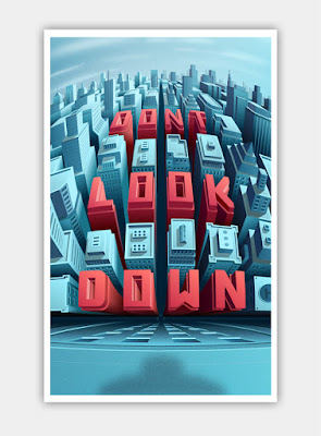

Final result
Stock images used

Background: http://elenadudina.deviantart.com/art/Background-12-184310936
Couple: http://eirian-stock.deviantart.com/art/He-And-She-IV-13381240


This tutorial is specially made for beginners so we will only use two stock images. We will also use a few adjustment layers in order to blend the images (make them match the new imag) I will try to give you as many details as I can so I’m sure you can follow along.

A couple of basic concepts

Have a goal

It might sound stupid but before you start working it’s good to know at least what style of manipulation you want to make. That’s important because it will make things easier when it comes to searching for the stock images you need for your artwork.

If you need to, you can look for inspiration on places like deviantart, behance, shadowness…

So it’s a good thing to plan what you want to to, have a basic idea of how you want the final result to look like.

Work flow


This is what I do when I make manipulations and pretty much anything in Photoshop.

First I work on the “physical structure” of the artwork: placing the background, objects, people and other elements that make up my artwork.
After that I deal with the shadows if I have to.
Third, I make color and contrast adjustments to each element to make them blend together and be uniform in terms of color and contrast. (usually I do this on each element after I place it on the canvas)
As a final step, I deal with light effects and illumination and also with general colorization and other general adjustments.
This is just a basic guide that I follow almost naturally, and it’s my own personal style.We will apply this concept on this tutorial but after you got the idea you can do things however you want.

Remember that there isn’t a correct or incorrect way of doing things in Photoshop. Whatever works for your is ok, as long as you get the results you want and your happy with it. So let’s start.

Step 1


Open Photoshop and create a new document 1100px wide by 700px high. We will start working on the “physical part”, so open the background image of the train tracks. Copy it and paste it over your document. You can make is smaller using the Free Transform Tool (Ctrl+T) or from the menu Edit>Free Transform. I scaled it down to about 25% of its original size.
For this particular tutorial, I will use the “mood” of this background image as a guide when making the color and contrast adjustments to the rest of the elements that I will add next. I wanted to create something more romantic and this golden sunset is perfect, which is why I decided to use it as a base. So I will try to match the ambient color and luminosity of the other elements to match the background.

Step 2

Now that you have a base to work on, add more elements to it. Open the holding hands couple and remove the background. There are multiple ways of doing that but for now we will use the Pen Tool technique which is my favorite.


So select the Pen Tool (P) and on the Options bar activate the Paths option. Now start drawing a path around the contour of the bodies (see image below). When your done, with the Pen Toll still selected, right click and choose Male selection, when the selection is active, copy with Ctrl+C or from Edit>Copy. Now paste that over your background on a new layer.
Step 3

Now, we are on the third step of our guide which is color and contrast matching. Remember that I said I will use the background as my reference? So what do I need to do in order to make these people blend in with their surroundings?

There are several options and all of them involve using Adjustment Layers (I suggest you use adjustment layers whenever possible). You can use: Color Balance, Photo Filter, Gradient Map, Selective Color or even the Channel Mixer. The decision of which adjustment layer(s) you will use belongs to you but some options might be quicker than others.


In this particular case I used Photo Filter with an orange color because it’s the easiest one to use and for beginners I think it’s the right choice. You can experiment with other Adjustment Layers and see what results you get.

Remember that I only want to change the tint of the hands so I will have to use this adjustment layer as a clipping mask, otherwise it will affect the entire image, including the background which I don’t want because the background looks ok already. Also, don’t forget that you can change the blend modes of the adjustment layers. In this case I used the Color blend mode.
Ok, now we can move on and start adding light effects. It’s important that you identify the light source on your images and you can do that by simply looking at the shadows or highlights on the stock images that you use. Once you do that it’s a generally a good idea that if you create some yourself, follow the direction of the existing ones. You can
In this example we have no shadows but we have light. Our main light source (the sun setting in the background) tells us how we should make the shadows and highlights. Luckily for us, we only have to worry about the highlights and since the light comes from the front, we must create the highlights on the edges of the hands and the bodies. Light effects like this, will make the artwork a lot more realistic and better looking.


A quick trick to do that is using Layer Styles: Inner Glow or Inner Shadow. I used Inner Dodge with the color #A18150, the Color Dodge blend mode and the Size set to 6px. On the video walkthrough I used Inner Shadow just to show you that you can do it that way too.
Step 5

You can give a touch or “romance” to this by adding dreamy light effect using the Brush Tool (B). So, create a new layer above all the other layers and name it glow.

Select the brush too and use a 500px soft brush and stroke once with the color #DF9B5D to create a soft orange dot over the couple’s hands. Then change the blend mode of the glow layer to Screen.
Step 6

We are now done with the light effects and the adjustments of each element (only the hands in this particular case) so we can move on to the general adjustments.


Here is where you decide how your final output will look by choosing which adjustment layers you want to use and how you will use them. I kept it simple and I used only one adjustment which is a Gradient Map set on Hard Light at Opacity 15%. See image 6 for more details.
So, as I said, this is pretty much the same process I follow for all my manipulations. With a bit of practice you will improve. Probably the most difficult thing to achieve (I say this because it’s a very common “mistake” I see) is making the adjustments look believable.

Most beginners pump the contrast and colors and they end up “burning” the image. Remember that sometimes less is more. So, I hope you found something useful on this article, I tried my best. It’s just a matter of practicing. 

how to Making Your First Photoshop Manipulation

By: Unknown on: 7:18 AM
In this episode you will learn a few options that you have to make different kinds of selections in Photoshop. How to load selections and how to use the Refine Edge option to create perfectly sharp edges.In order to demonstrate you how to work with selections, I will show you how to replace the background of a simple stock image using the Magic Wand Tool and the Refine Edge option.


Selections In Photoshop CC

Photoshop for beginners  Selections


Selections In Photoshop CC

By: Unknown on: 8:47 PM
HOW TO CREATE SOCIAL MEDIA ICONS USING THE FREE FONT AWESOME FONT IN PHOTOSHOP

In this tutorial you will learn how to create some cool looking social media icons in Photoshop by simply using the free font Font Awesome.
What you’ll be creating
We will be creating some flat social media icons: we’ll start with the background then proceed with the icons. We’ll finish it up by creating some effects to make the icons more original like the gloss effect or the long shadow. You’ll need Photoshop CS3 or newer to follow this tutorial.
Tutorial Resources
  1. Font Awesome font
  2. Font Awesome Cheat sheet
Step 1
Create a New File at 500×400 pixels
Create a New Group and name it ‘Background’
Step 2
Fill your background with the color #e7e9ea using the Fill Bucket Tool.


Step 3
To add more effect to the background we will be adding some gradient. Click on the Adjustment Layer icon and choose Gradient… and use the following settings:
Blend Mode: Soft Light | Opacity: 25%

Step 4
Create another group and this time name it ‘symbols’
Step 5
Before anything else, to make this work easier and more organized-looking, we need Rulers and Grids. These can be accessed by simply going to View > Rulers and View > Show > Grids. Here are my setting for both the Rulers and Grids (this can be accessed by going to Edit>Preference):
Now that we have that, we need to add giudes and this can be done by simply clicking and dragging from the ruler. Click and Drag from the vertical ruler if you want a vertical giude and vice versa. Here is how I divided the canvas (each icon being 50×50 pixels big and a 25 pixels space between each one):
Step 6
With the font we are working with in this tutorial, Font Awesome, you can add costumizable icons for your website. Normally, this is done by placing the CSS of the font to your website but since we are working with Photoshop, we need to copy each icon you desire to use from their Cheatsheet. So open up the said page, scroll down and look for all the icons you would like to use. I used the icons for the following (social media) sites: Twitter; Facebook; Tumblr; Google +; Instagram; Youtube; Twitch; Dropbox; Deviantart; Pinterest; Skype; Feed.

Step 7
Once you have found the icon you would like to use, copy it (Highlight it then Right Click> Copy..)


Then go back to Photoshop and grab your Text Tool from the Tools Panel. Change the Font settings as shown:
Step 8
Repeat the previous step until you have pasted all the icons you would like to use.

Step 9
Create a new group and rename it to ‘icon bg’ and place it below the ‘symbols’ Group
Step 10
Create a new layer and place it into the group we just created. I renamed the layer to ‘icon bg’.
Step 11
Using the Rectangular Circle Shape Tool (located at the Tools Panel below the Text Tool) I created the background of the icons following the guides we did earlier. Create the background on that layer only to make your work easier to look at.
Here are all the colors I used:
Twitter:#6bd1f4;
Facebook:#5a93cb;
Tumblr:#3c6a9c;
Google +:#e44940;
Instagram:#9bd29d;
Youtube:#f4504c;
Twitch:#a96db6;
Dropbox:#81d5ed;
Deviantart:#6e8e61;
Pinterest:#f25f5f;
Skype:#67d5f4;
Feed:#e9951d;
Now you don’t specifically have to use the same colors as I did, you are obviously free to change the colors and use whichever color you prefer to make your work more original.

If you don’t like the look of the rectangular circles, you can always use other shapes like a square or circle. To make a perfect circle or square, be sure to hold the SHIFT key as you are making them.
Step 12
If you are already pleased with what we have just done, you can stop here but if you would like to spice up the icons some more go on and continue reading. We shall start by adding some Drop Shadow to the icons. Open the ‘symbols’ group, select one of the icons and click the fx icon > Drop Shadow. Use the following settings:
Step 13

Repeat the previous step with the rest of the icons. To make your work a lot easier, right click on the layer > Copy Layer Style. Then select the rest of the icons/symbols layers, right click > Paste Layer Style.

Step 14
Now add some Inner Shadow to the background of each icon. So open up the ‘icons bg’ group, select the layer and click the fx icon > Inner Shadow. Use the following settings:
Step 15
Create a new layer and name it Gloss Effect. Change the foreground color to #ffffff; using the Rectangular Marquee Tool, create some rectangles that is just half the size of your icon (approx. 50x25pixels). Do this for all of the icons.
Then Change the Blend Mode to Soft Light and Opacity to 20% and Fill to 80%.
Step 16
(If you are doing this step, be sure to not show the Gloss Effect) Create a new layer and name it to Long Shadow. This step is a bit harder compared to rest of the effects. Place the new layer below the Gloss Effect layer.
Step 17
Grab the Polygonal Lasso Tool and start creating some tilted rectangles: start by following the shape of your icon only from the bottom-right side then make a diagonal line until it reaches the bottom-right end of the icon’s background,make a straight line just until it reaches the center of the background then connect the lines.
Step 18
Last step! Change the layer’s opacity to 10% and it’s fill to 0%.
Now Click on the fx icon and select Color Overlay…. Use the following settings:
Now Select Gradient Overlay.. and use these settings:

Final Results

Download the PSD


HOW TO CREATE SOCIAL MEDIA ICONS USING THE FREE FONT AWESOME FONT IN PHOTOSHOP

By: Unknown on: 10:22 AM

 
Copyright © adobe plus | Mr Bashar By Themes
Blogger Templates Wallpapers Hack Wfi